*The contents of this case study are based on personal experiences and professional expertise. Please note that certain details and information have been omitted or altered to protect the privacy and confidentiality of individuals and organizations involved.*
“Make it simple but significant” - Don Draper
Overview
In 2021, our client reached a pivotal point in our product roadmap where a design system was needed. This is how we created a new experience for how designers and developers work together.
Goals
Growing from a company of 30 to 200 in less than a year has led to the rapid development of our products used by healthcare organizations. In the time it took to create three unique products, each product had a unique look, feel, and experience.
As our team got together to create a unified brand and voice - we found ourselves at an impasse, an unnerving realization that we perhaps had wandered too far and needed to turn back.
Design Debt
The gaps in each product became more apparent and usability issues increased. Combining our products forced us to confront the design and technical debt we had accumulated over the past year.
Support Sales Initiatives
Often our sales team would come to us with rush orders to produce a UI to show clients in sales meetings. This would take time away from projects. Having a design system with established components would help us deliver these requests faster so that we can focus our time on our projects.
Research and Testing Initiatives
We often found ourselves stuck on iterating over the finer details of the user interface. This gives us little time to work on research, engage with our users, and validate our ideas. With a design system in place, we hope to be able to spend more work validating what we need instead of deciding what we want.
This design system would need to comply with accessibility guidelines, work seamlessly for our developers, and allow for scalability. Our goal was to allow us freedom from redesigning the same components so that we may focus on innovation.
My Role
I strategized the creation of the design system from February 2021 to December 2021.
Two junior UX Designers and I created the UX work, produced all deliverables, facilitating interviews and testing, and presented our findings to our internal teams.
The Discovery
With our goals in mind, we began by individually interviewing designers and developers about our current process. Our objective was to understand what was currently working, what pain points have developed on our projects, and uncover advice or suggestions to help make the experience collaborating better.
Early Insights
Our interviews with three designers and five developers led to us developing early insights that would help guide us when creating our design system. We were able to uncover three themes that would help guide is in the creation of our design system.
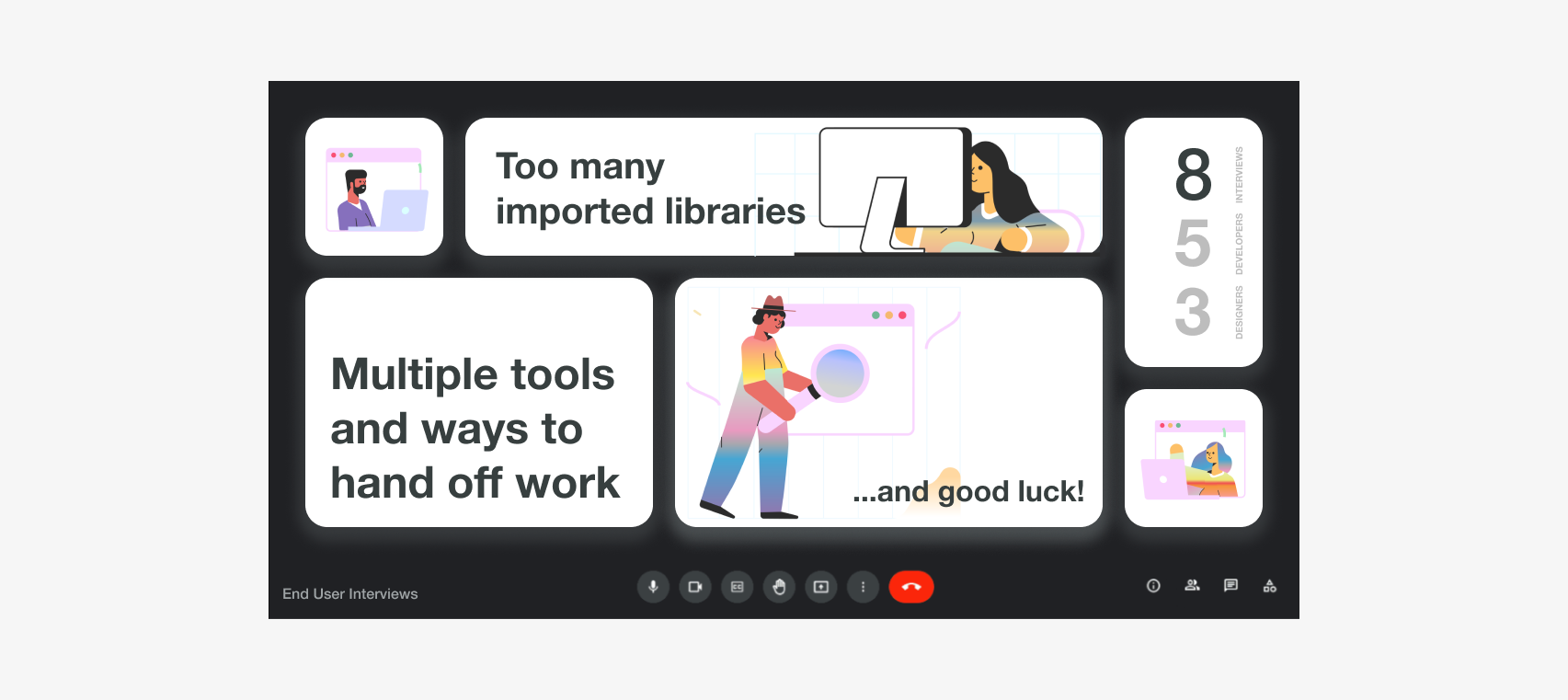
Many imported libraries
it seemed like with each project, developers would import libraries they were comfortable with to implement functionality. Once a developer joined the project, they would have to download multiple libraries
Multiple tools and ways of hand off
dependent on the assigned designer, developers have experienced hand offs in figma, zeplin, and sketch
...and good luck!
Perhaps a resourcing issue but often changes were not documented leading to guessing and assumptions being made when designed. Designers were often thrown onto other projects and left without seeing or recognizing the final result
I’ll admit I wasn’t surprised by the insights gathered from the interviews. However, though I was aiming to create something that could be used by the entire organization, I recognized that everyone has previous experiences that should not be stifled in order for us to create a singular identity. Nor would that be well received.
KPIs
Before we came up with a design strategy, we wanted to define what success would mean for this design system.
We used Google's HEART framework to identify goals, signals, and metrics we could use to guide our discovery. By using the HEART framework, we emphasized that success was defined by our experience using it. We wanted our development team to feel like it was effortless to use and easy to get support.
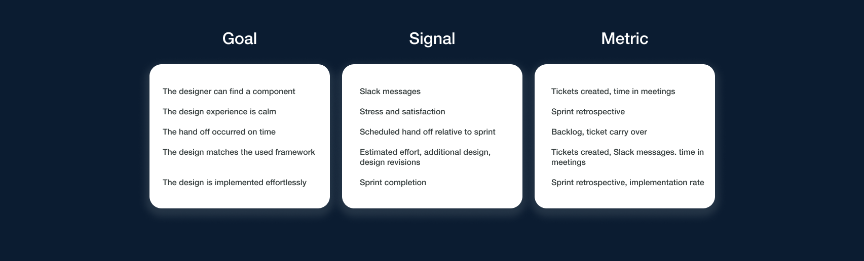
As we ruminated over our KPIs, it occurred to us that it wasn’t so much creating this design system that was going to be the challenge but maintaining it. At any point we leave something out of the design system, there would need to be a substantial amount of effort to create and assimilate a new component into the design.
If we did not account for the extra effort that it would take to maintain this design system, it can easily seem forgotten and ignored.
We decided to reframe our problem from
How might we develop a design system that supports innovative across our designers and developers
to
How might we help designers and developers form a better implementation plan?Working Backwards From Perfect
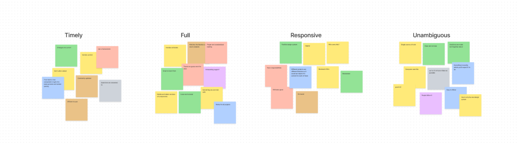
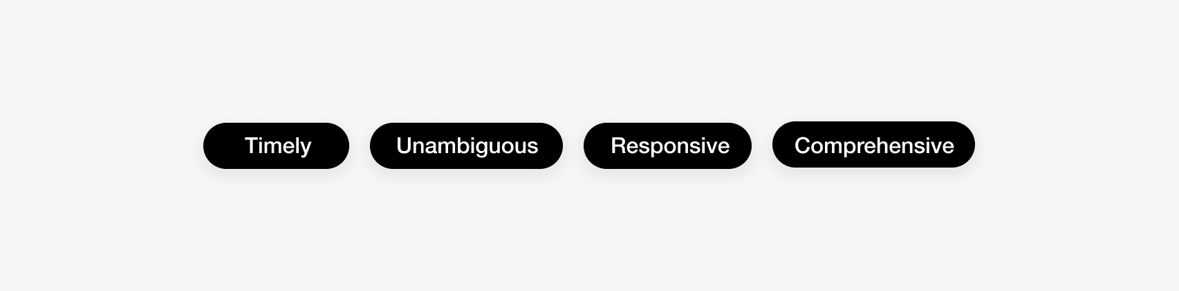
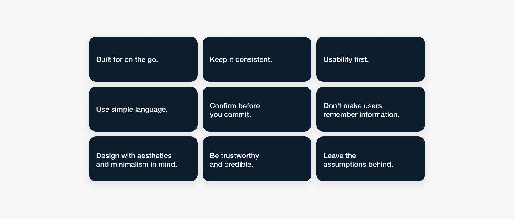
We decided to start from where we could consider the perfect experience for both designers and developers. To do this, we workshopped out what each of us thought a perfect experience would look like using FigJam. Four key values emerged from our collaborative effort:
This design system seemed more like a middle ground between the work of a designer and a developer. I wanted to make sure that we would account for the preferences of the developers by understanding their tools and processes. To do this, I took a concept I learned from Cooper Design, and surveyed 8 developers and 4 designers to learn their processes and preferences when it comes to communication and collaboration.
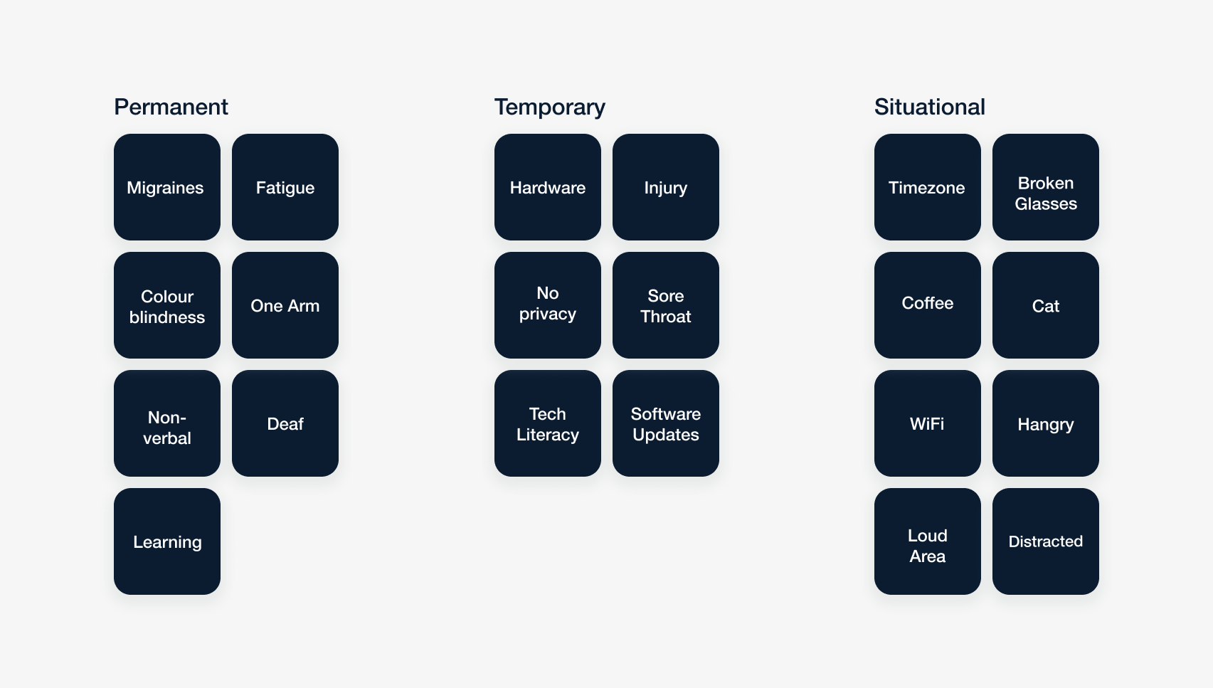
We were starting to converge on our design system. To make sure we could accommodate designers, developers, and product owners we decided that we needed to explore the difference constraints a user may need to work through. This led us down the path of creating a persona spectrum.
An inclusive design
Speaking with the designers on our team, we found that we had a shared experience with personas. It was either: we forgot about them once we entered our implementation phase or when we tried to validate them with our users - they could not relate to them.
We decided to try Microsoft's persona spectrum instead to understand the contraints our users may face. These would highlight permanent, temporary, and situational constraints that our users might have to deal with. By designing with a constraint in mind, we can consider other constraints as well. For example, designing for someone with a permanent vision impairment, we would also be designing for someone who may have broken their glasses. Creating this persona spectrum helped us to become more empathetic to a variety of users.
A persona spectrum highlights the range of temporary and permanent challenges an individual might face when interacting with our design system.
Solution
Design Principles
We had accomplished a lot of user research up until this point and my concern was that as we developed this design system, we would lose sight of the why behind our decisions.
Our team developed a set of design principles that aligned with our initial research to fall back on whenever we would get stuck or if a decision required extensive discussion.
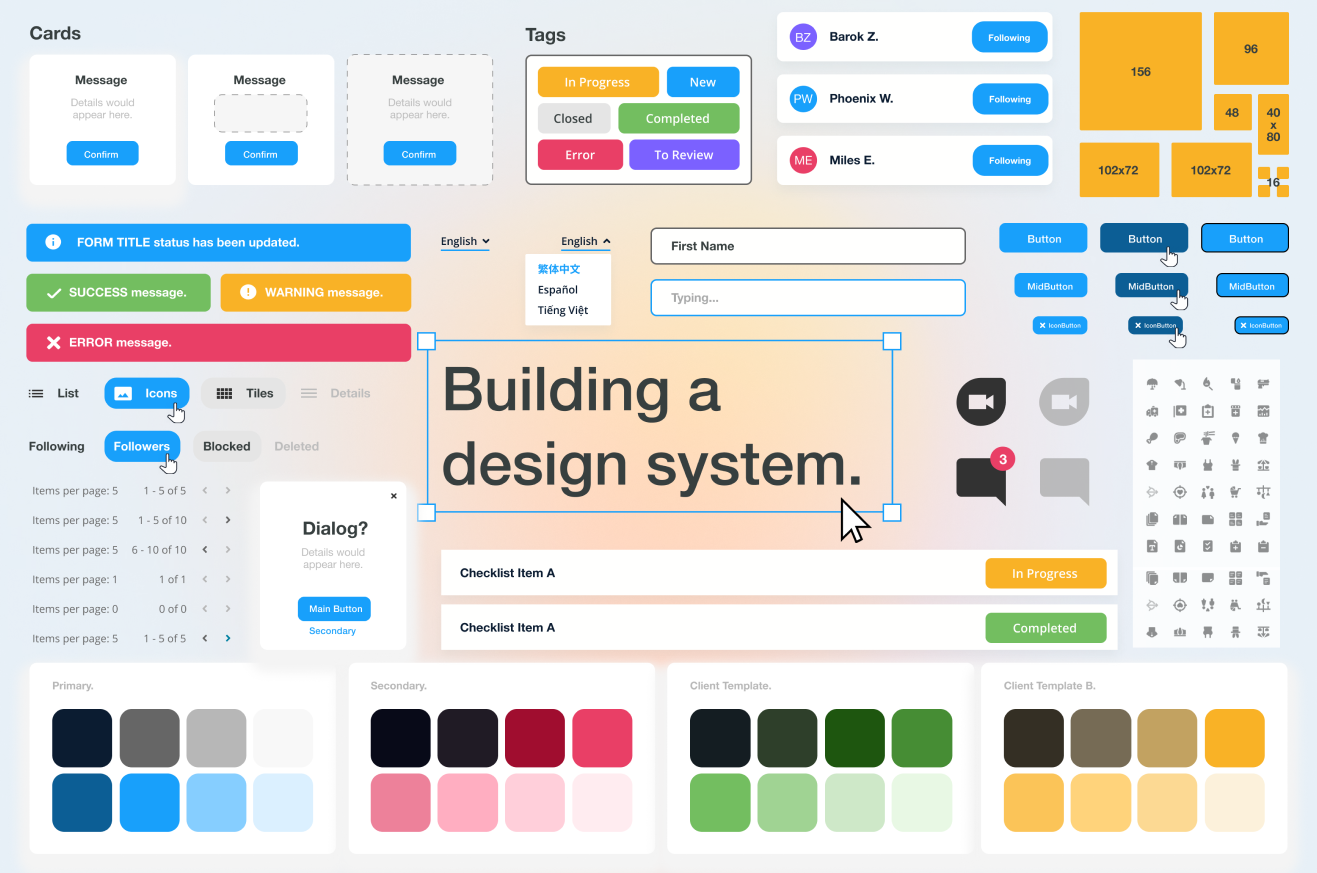
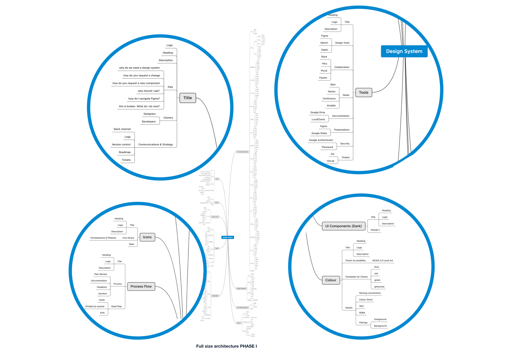
System Architecture
Before working on the components of our design system, we organized our architecture using xMind. Every component was documented along with each use case. Our design system would also be the place we organized our project tools and we included that as well.
One of our pain points was the number of tools we used that did the same thing. After our interviews, we realized that we had six different tools used throughout our projects to capture notes. This made it incredibly difficult to organize the team and onboard new members. Our design system would need to document which tools we use for what and where our docuements can be organized.
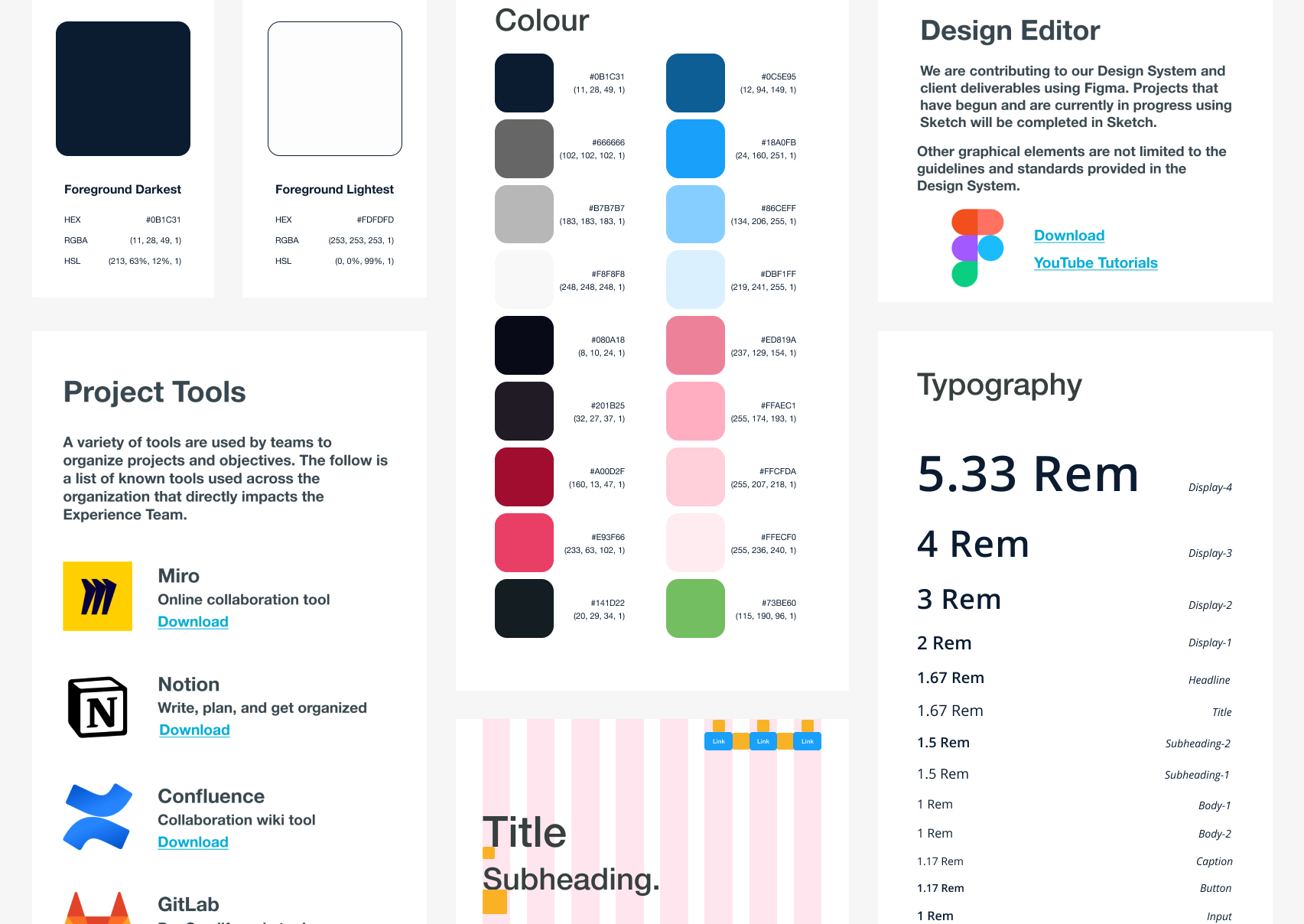
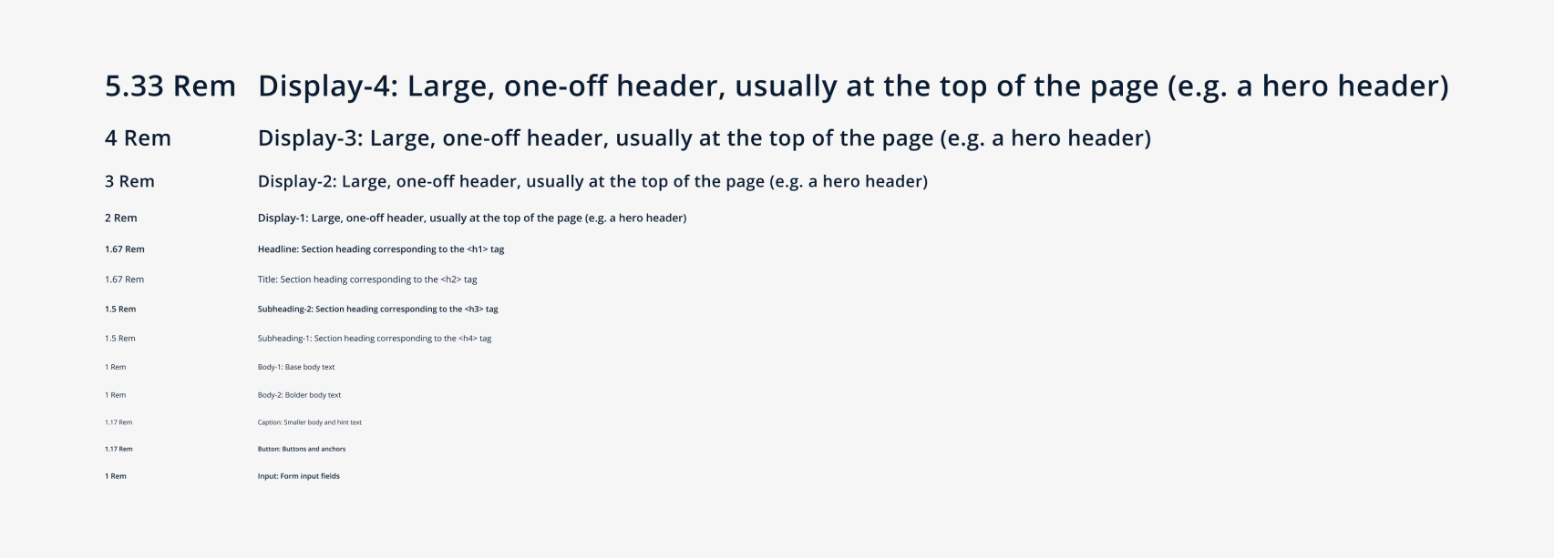
Typography
We began with typography to describe when and how fonts should be displayed to a user. To comply with usability guidelines, we mapped out the HTML tags for each of the fonts. Depending on the project, developers would choose between pixels and rem. We made sure to accommodate both and allow for conversions when necessary.
Use of Colour
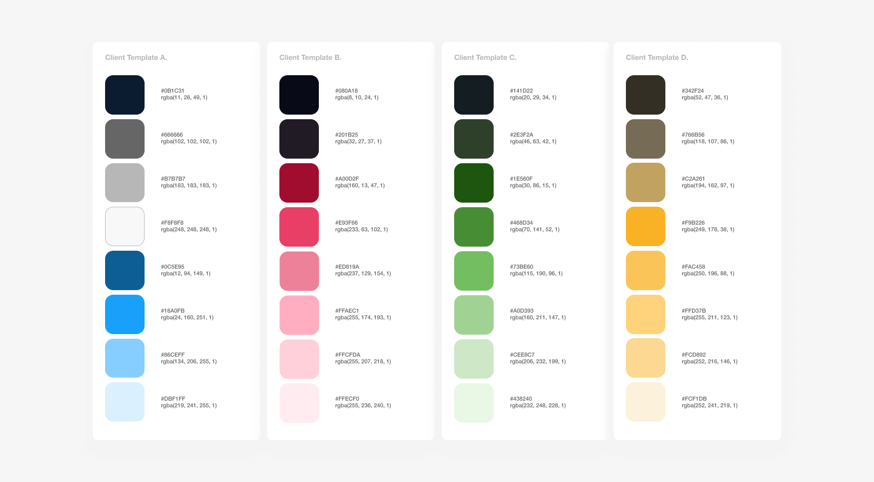
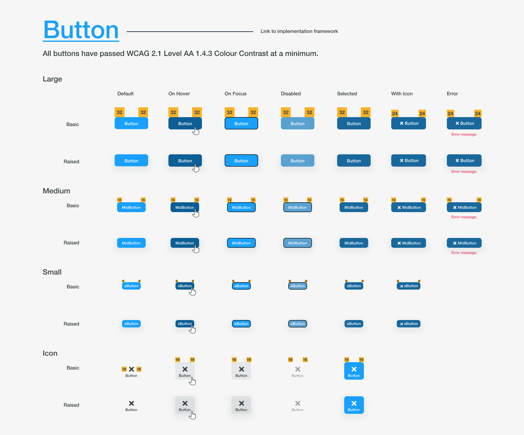
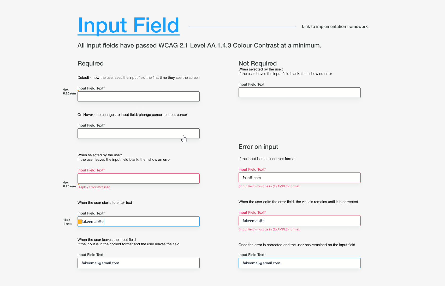
In a separate file, we created a colour guide. Each colour would be listed as a RGBA and HEX value. To comply with accessibility guidelines, specifications were given to colours that would be primarily used as foreground colours and background colours. Our goal was to hit WCAG Level AA 1.4.3 Colour Contrast at a minimum. We worked with our current branding and marketing designs to create colour combinations that passed and exceeded this accessibility guideline.
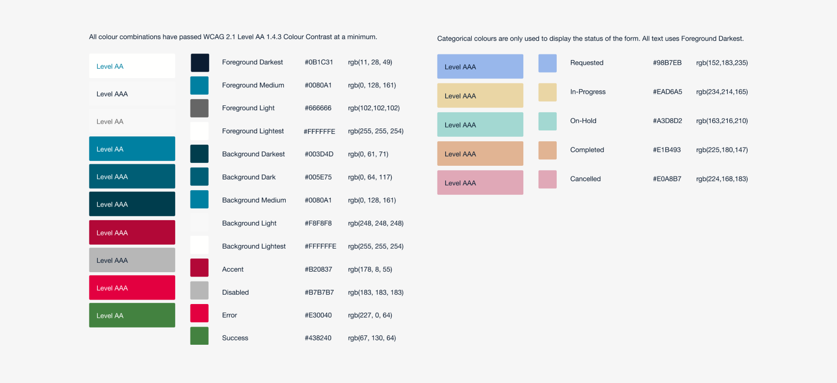
As a company that develops products and custom solutions, we must accommodate the branding of our clients. We needed to act strategically to be able to reuse our components as much as possible. We wanted to allow our clients to be flexible but reduce the headache it would cause our front end devs when it came to customizing the colours of the application. We researched our clients and found most to use branding schemes with blues, reds, greens, and yellows. Four colour schemes were created to allow our clients to customize their application without breaking accessibility guidelines.
In future iterations, we plan to incorporate a dark mode that our developers and leadership are very excited about.
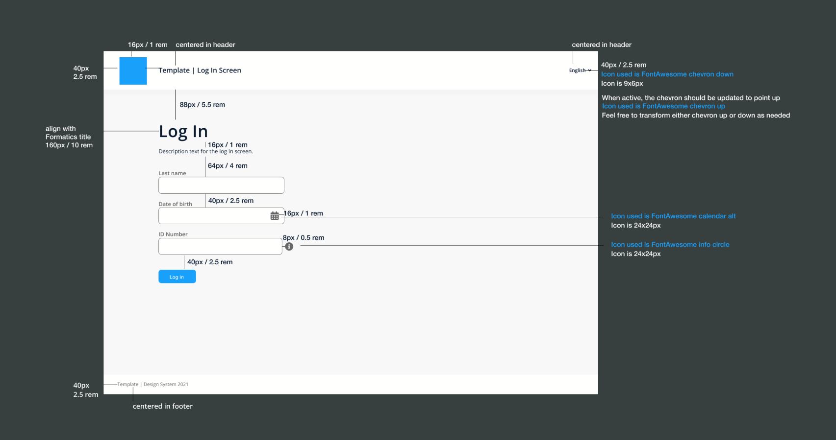
The First Button
For our first component in our design system, we decided to create a button. We knew we wanted to include as many states and edge cases as possible so we started by sketching different layouts on what would be best for developers to read through.
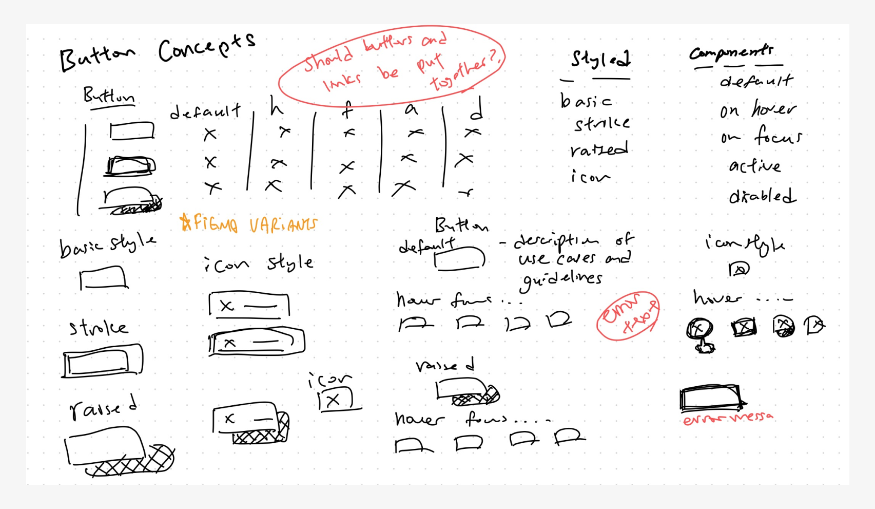
We decided a table layout woud be best and organized it since our developers had a preference for scrolling vertically over horizontally. Variations to our button would be ordered from most frequently used to least frequently used. In our component layout, we included a link to the documentation for the component used in a particular framework. Any considerations towards the Web Content Accessibility Guidelines would be documented as well.
Microinteractions
As we continued to iterate through our design system, one piece of feedback we received from developers was the inclusion of microinteractions. As we workshopped out how we wanted to display this, we ended up creating a flow in Figma and an animation for the developers to reference. Our conversations regarding microinteractions were quite intricate and focused on fine details. It became clear that there were miscommunications because of how specific these microinteractions needed to be. The animation helped us illustrate our decisions so it was concrete. This animation was created using our Figma components and Adobe Premiere Pro.
High Fidelity Designs
In each unique project, we would import our design system and use it to create our mock ups. This was done so that developers would not have to dig around the file to find whatever component they were looking for. It was a bit of a challenge introducing Figma to some teams so we had to run a few Figma 101 workshops to help people get familiar with the application. Once our teams saw that the designs were annotated and how easy it was to switch between states with variants, it made us feel like all the work we had put behind it was worth it.
Change Management
How we were going to handle bugs in the design, changes, and approvals was one of our greatest challenges. We borrowed much of our concept from the development process and required two designers to give approval to a change before it would be able to make it into the design system. This was important because it helped us kept us from creating and using duplicate components.
Much like a pull request, the designer must prove it has been tested and the design is responsive and well documented for it to be approved. If developers were to find errors in the design or have questions raised, we opted to use JIRA to keep track of changes through tickets. The same process would be followed however one approval must come from a developer.
Impact
We published this design system to our development teams and found that it was received warmly. Overall, teams felt like there was less guessing and assumptions being made, and a more concrete design. One of the feedback we received was that there felt like less pressure to get things done about the user interface which left us more time to think about the usability of our design.
An unexpected impact was that we were able to develop demos for sales faster. Something that used to take a lot of time and coordination was made easier by pulling and modifying components in our design system.
Future Plans
We are using our design system to develop our latest product and working to include more elements inside it as our needs and the needs of our clients continue to grow.
In the future, we are looking to create a dark mode UI, incorporating analytics into this design system, and continue revising the project management docuementation in order to streamline our processes.
Retrospective
I found this project quite challenging at the start as it was done at the same time as I led another client facing project. But I saw the advantages we would have as a team going forward if this were put in place and exhausted my efforts to make this design system a reality. In the end, I think it was definitely worth it.